Product design leader & builder focusing on platforms and tools, helping teams achieve excellence at scale.

Selected Work – Polaris
Company: Shopify  |  Role: Director

A Design Uplift for Shopify

A modern, purposeful workspace for merchants

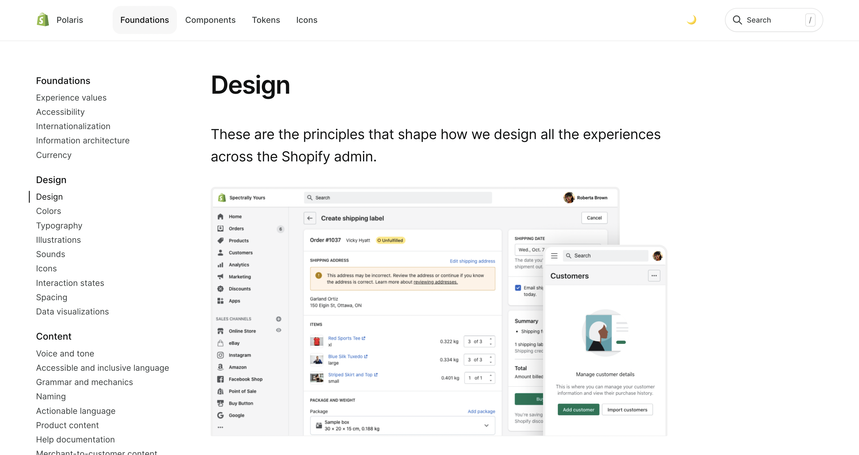
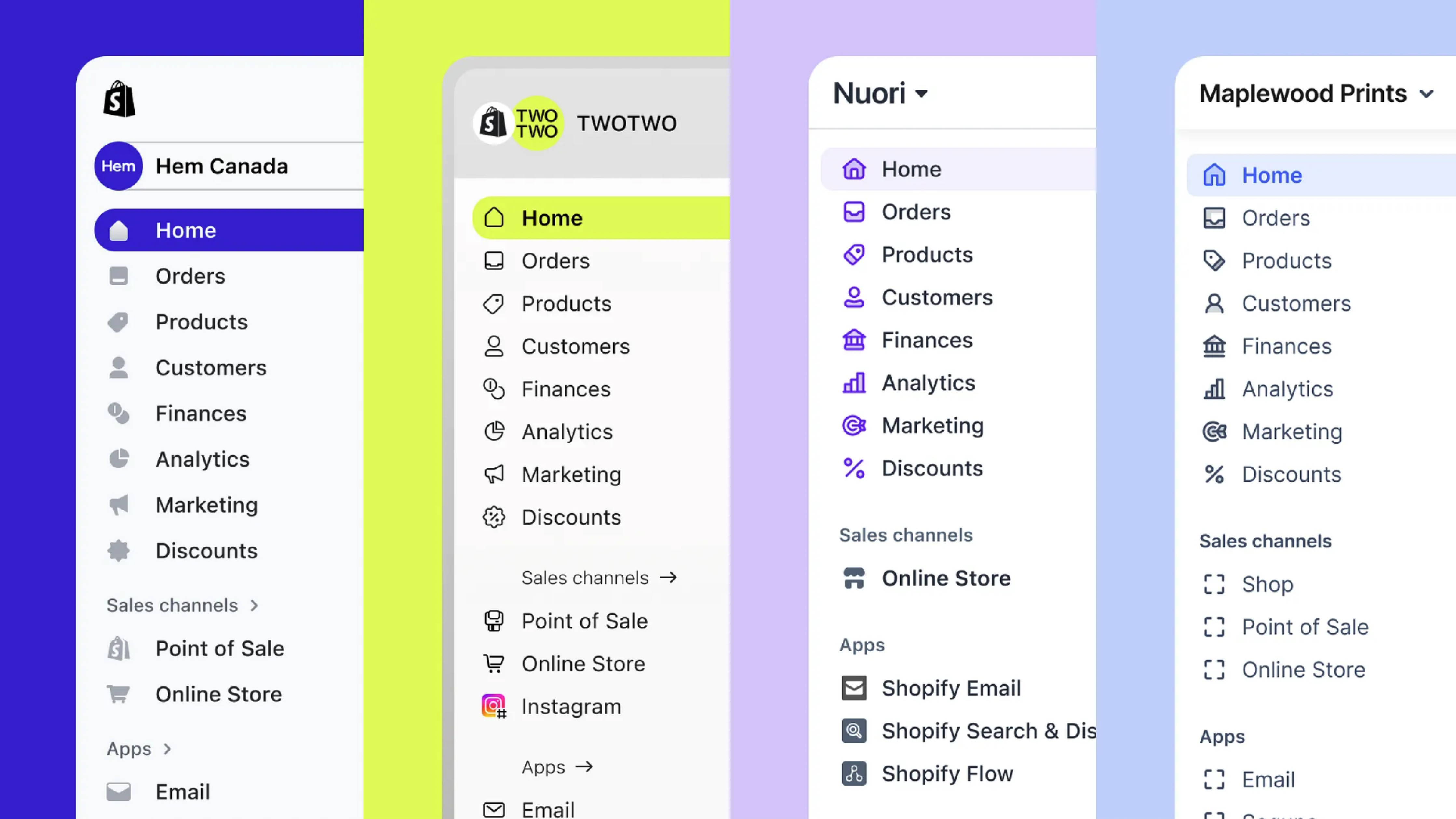
In 2022 – about a year after I joined Shopify – the team embarked on a sizable mission: modernizing the look and feel of the merchant admin.

Shopify's merchant admin is the core product. It's where merchants build their business and get things done. It's a massive and complex application spanning thousands of unique page routes. Despite this – or perhaps because of it – the product hadn't seen a visual upgrade in years.

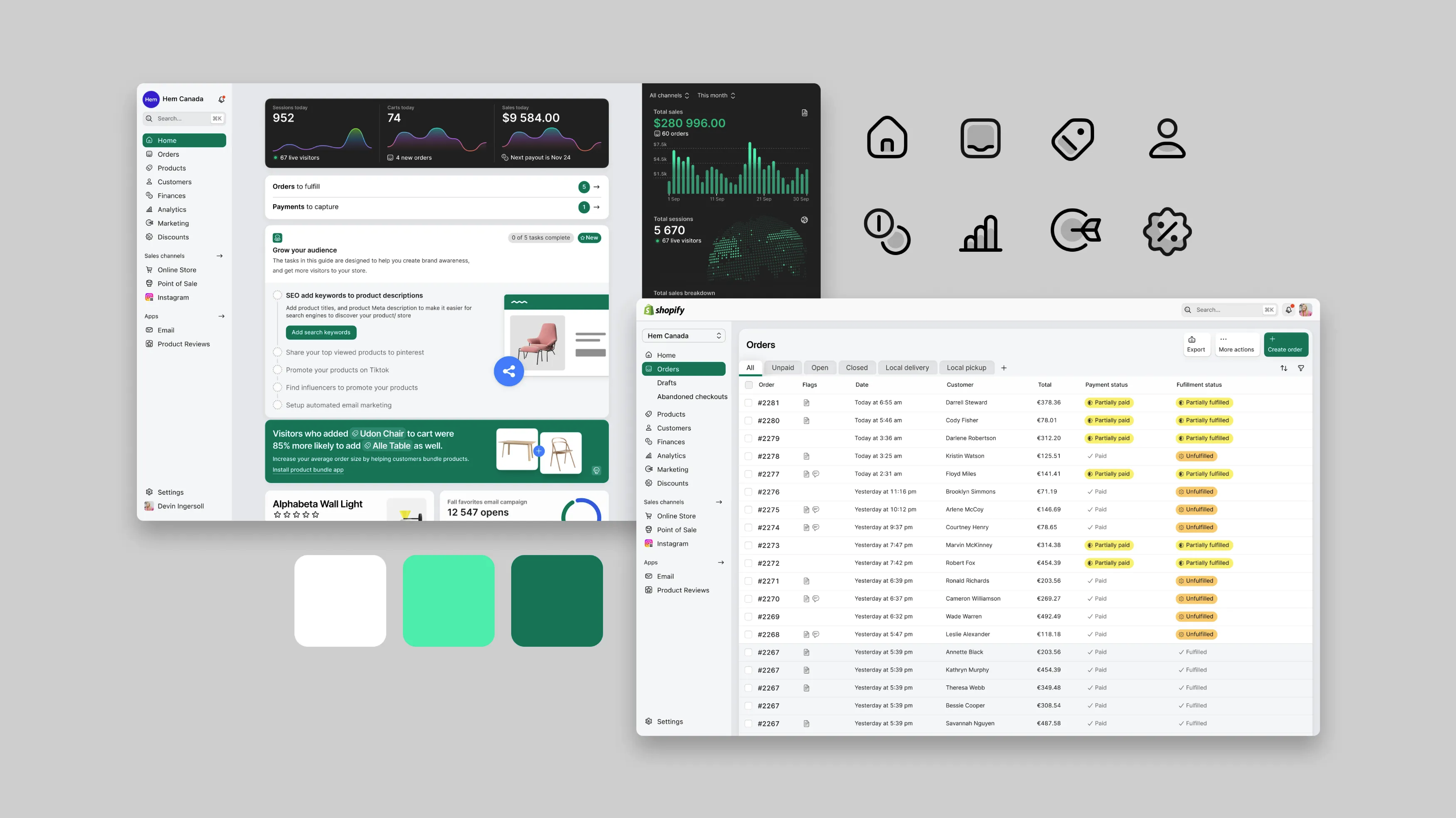
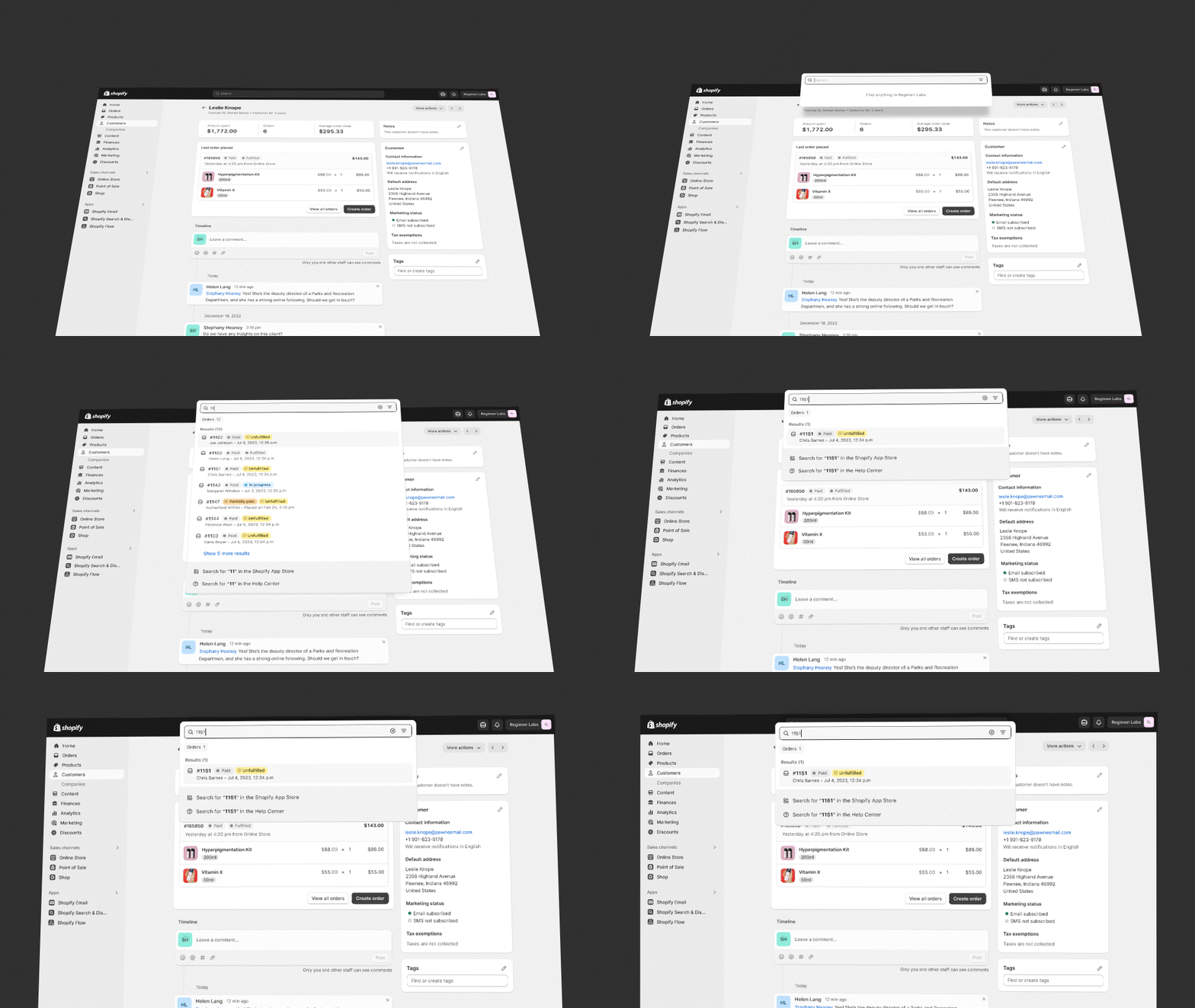
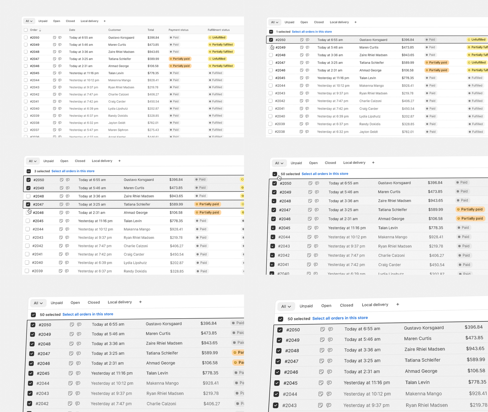
Polaris was already a mature design system, so we had a strong foundation underpinning the design. Still,  a strong foundation can be difficult to break away from. Doing this required the freedom to explore, and the team produced dozens of studies such as the one shown above.
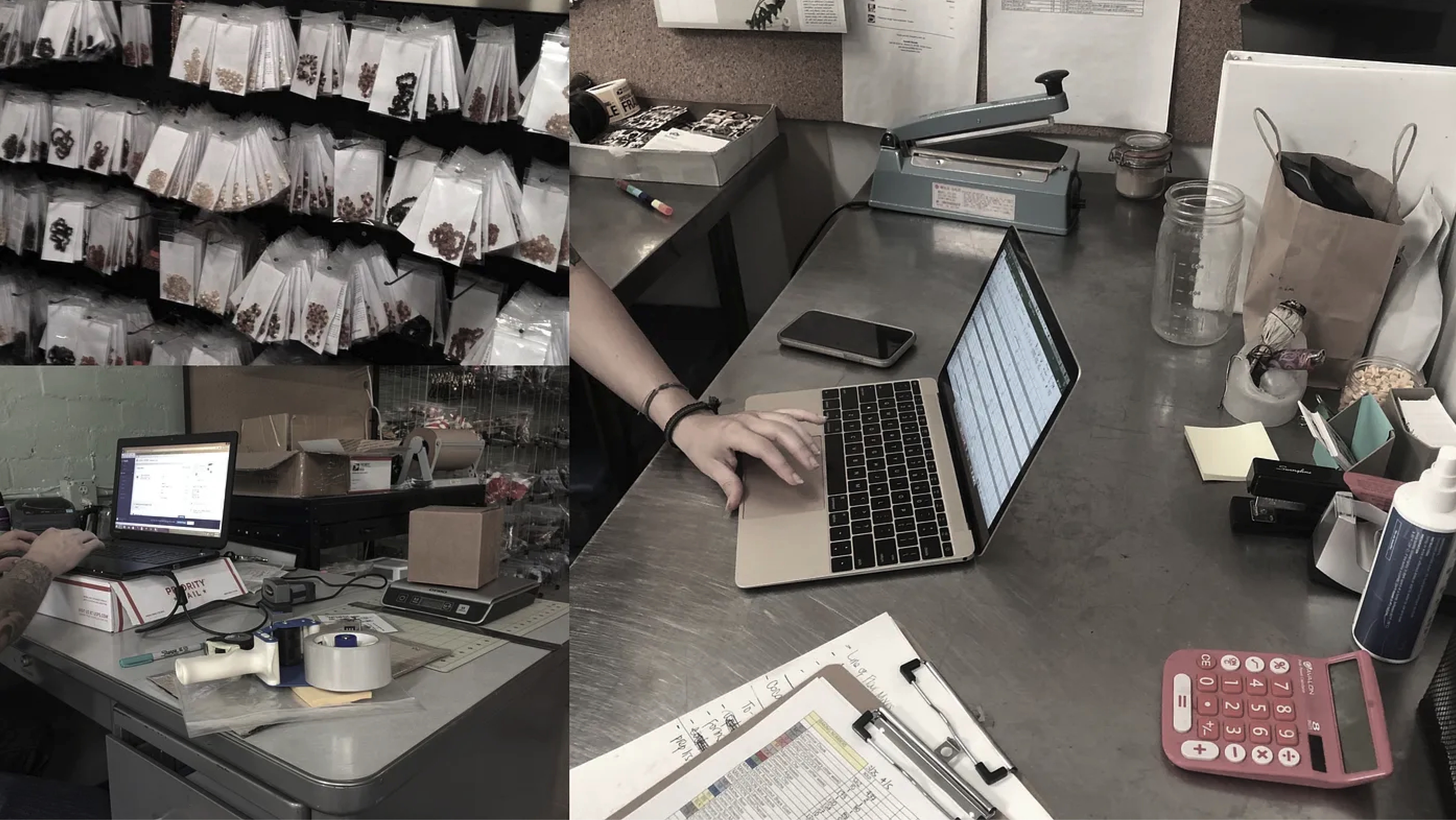
We also looked at how customers work by visiting real merchants and studying their setups.

What kinds of spaces do they occupy?

What kind of kind of lighting do they work under?

What screens do they use?

What are they surrounded by?
An undertaking of this size requires really good aiming and planning.

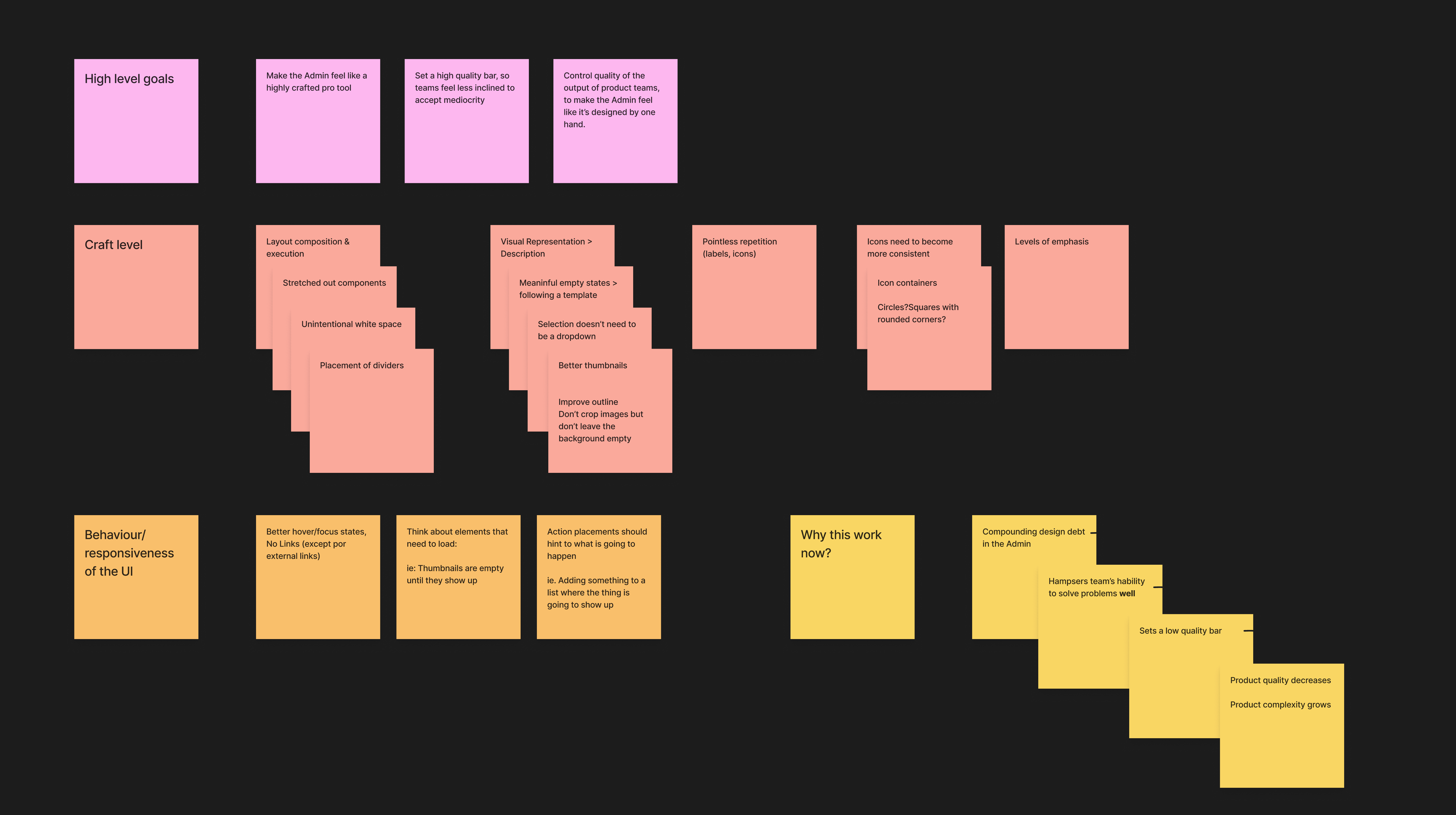
A big part of our mission was to help Shopify teams design better features and break out of the mediocrity that had proliferated over the years. How should we do that, specifically?

Our focus was on influencing the aspects of the design that could help Shopify feel like a pro tool that is crafted with intentionality and cohesiveness in mind. We prioritized things like thoughtful use of empty space, visual representation over description, removal of links, and better use of imagery throughout the product. We also narrowed our focus on specific behaviors, such as hover and focus, loading sequences and the use of stateful surfaces such as modals and action sheets.
Navigating complexity

One of the key challenges with designing Shopify's merchant admin – and most other business software – is how to handle the density and complexity of information. We can be selective about what we show the user, but ultimately each screen will contain a lot of powerful features.

With so much information and functionality on the screen, every pixel matters. Getting the details right – use of highlight colors, type size, icons, weight and spacing – is a high-leverage activity. All of these little decisions add up across every page. They make the difference between software that feels restful and focused vs. chaotic and difficult to work with. Each little design detail is meaningful, because they are repeated hundreds if not thousands of times throughout the product.
The reality of being a merchant involves a lot of context switching, too – so, wayfinding elements and clean iconography are critical parts of the user experience.

The team quickly sprinted through several iterations of how these should be crafted – weighing the fine-grained details of border and fill, and ultimately landing on 1.5px icon stroke and a 1px bevel for pirmary buttons with a high-contrast label that would stand out against the noise of index tables and pages that are filled with cards.

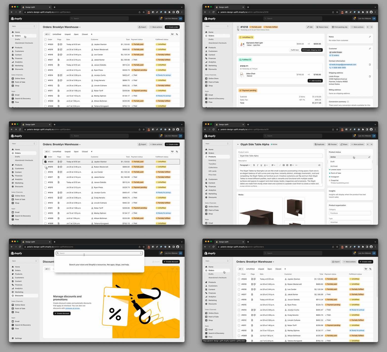
We ultimately ended up with hundreds of artboards stress-testing the new design across every core feature in the merchant admin.
Putting it all together

All of this culminated in a full modernization of Shopify's core product – the merchant admin. We progressively layered these style updates, starting with type, then moving sequentially to icons, colors and layout.
We also studied modern industrial design trends and looked closely at various materials. Although Shopify's merchant admin is software, we wanted to bring just a bit of tactility into the experience.

Not skeumorphism – just enough detail to make the product feel more interactive and lifelike. We also considered the design of Shopify's retail and POS products, and what Shopify's overall visual voice and tone might be to merchants.

Ultimately, the aim was to produce a flexible design system that works under a wide variety of real-world conditions, and can be used to deliver high-density displays of data and can handle complex functionality.
Selected Work – XD / spectrum / codesign
COMPANIES: ADOBE / GOOGLE  |  Role: SR. MANAGER

Designing Creative Tools

Adobe XD – the beginning

The story of what is now Adobe's premier digital design tool begins in late 2014 with a simple prototype, which was codenamed Sparkler.

This prototype pointed in a bold new direction for Adobe's creative toolset: a lightning-fast layout and transformation engine, and a streamlined, focused feature set. This implicitly recognized a fundamental truth that was not yet widely acknowledged within Adobe at that time: that tools such as Photoshop and Illustrator, powerful though they are, do not meet the needs of designers creating experiences for web, mobile and other natively digital environments.

Shown above is one of the earliest demos – a side-by-side comparison of the XD prototype and Illustrator, using the step-and-repeat tool.
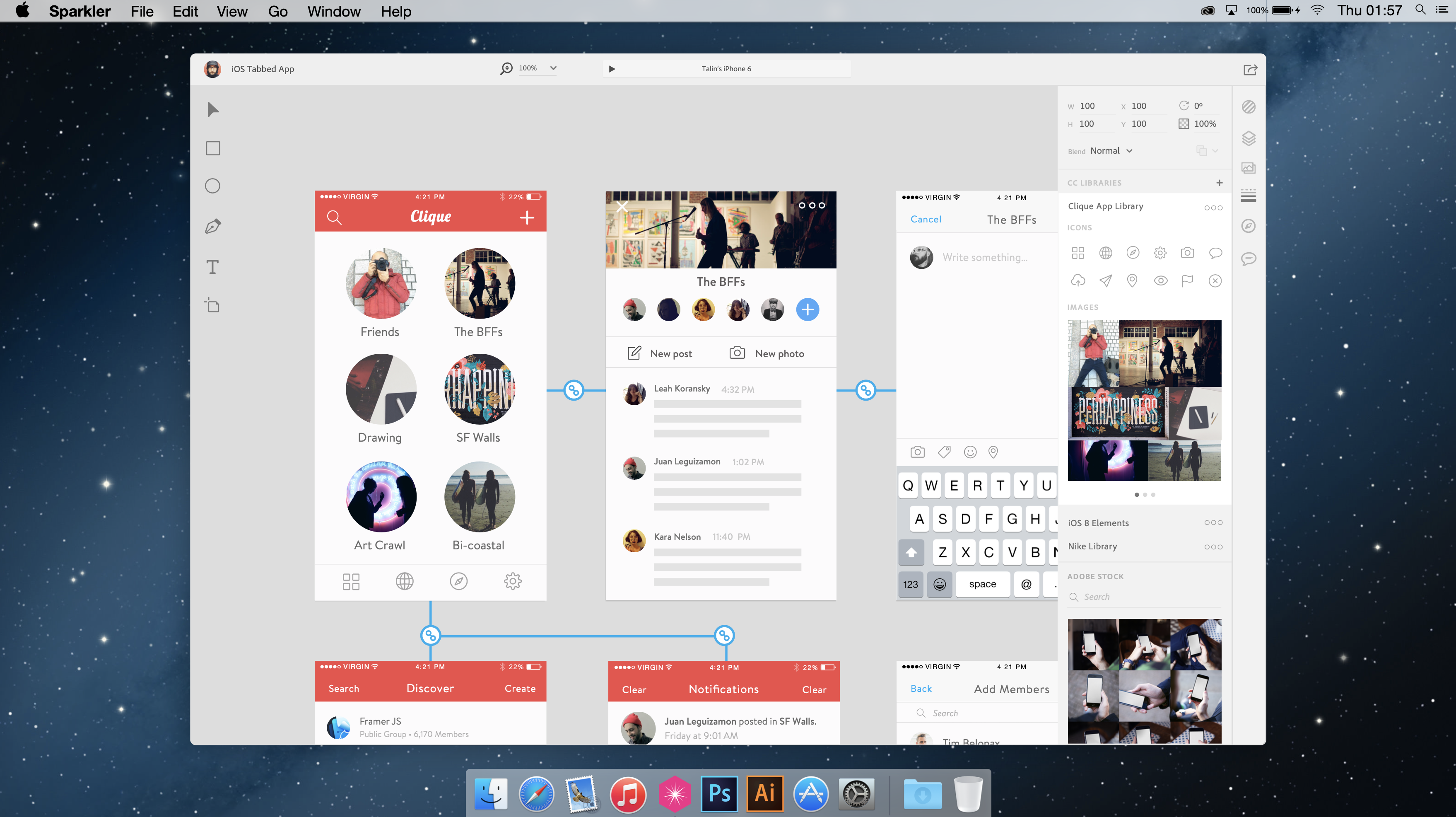
I was the first designer to work on Adobe XD. As time went on, I was joined by Talin Wadsworth, who helped articulate the vision further.

Our initial focus was on fast drawing and object manipulation. We eventually progressed to canvas behaviors such as artboard management and prototyping workflows, as shown above. We also explored collaborative design modes. All of these were a first for Adobe at the time.

One of the best aspects of this project was our ability to move quickly. We went through many rounds of rapid iterations, finessing the details of the UI and interactions. This velocity, combined with open-ended possibilities, made for one of the most satisfying times in my design career.
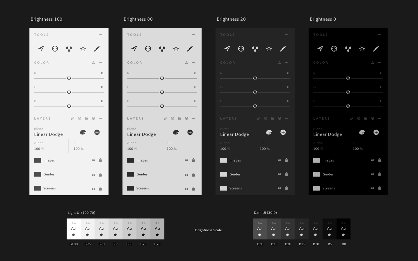
Spectrum – A bold new vision for professional creative tools

Later on, my focus at Adobe shifted to helping the company build the first version of Spectrum, Adobe's design system.

This was a fun challenge, working outward at a level of abstraction that would ultimately impact all Adobe products. My team's first goal, however, was to modernize the look and feel of the super dense and confusing UI found throughout Creative Cloud.
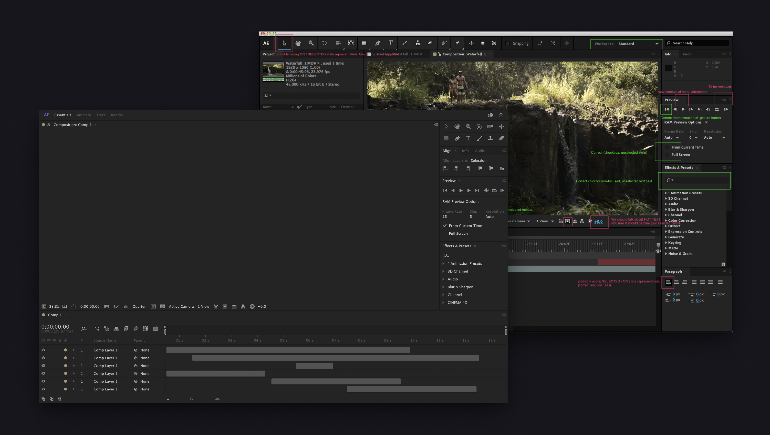
This all came together in a series of UI studies where we applied Spectrum's principles (Rational, Human, Focused) – along with the detailed thinking the team had done on color, scale, layout, UI controls and panel designs – into complete visions for each product in Creative Cloud.

This was an immense vision, encompassing everything from photo editing, illustration, videography, print design, 3D design and interactive design tools, such as Adobe XD, shown above. Spectrum wasn't just about how things look; it was also about how the workspace is organized, and how to make the creative toolset feel calm, spacious and inviting.

Working on Spectrum taught me that every pixel really matters, especially in dense workspaces. Where earlier versions of Adobe software had needless bevels, inner shadows and other decoration, Spectrum UI was simple and streamlined. We also ruthlessly stripped back the various colors and type styles and made everything a lot more accessible and easier to parse.
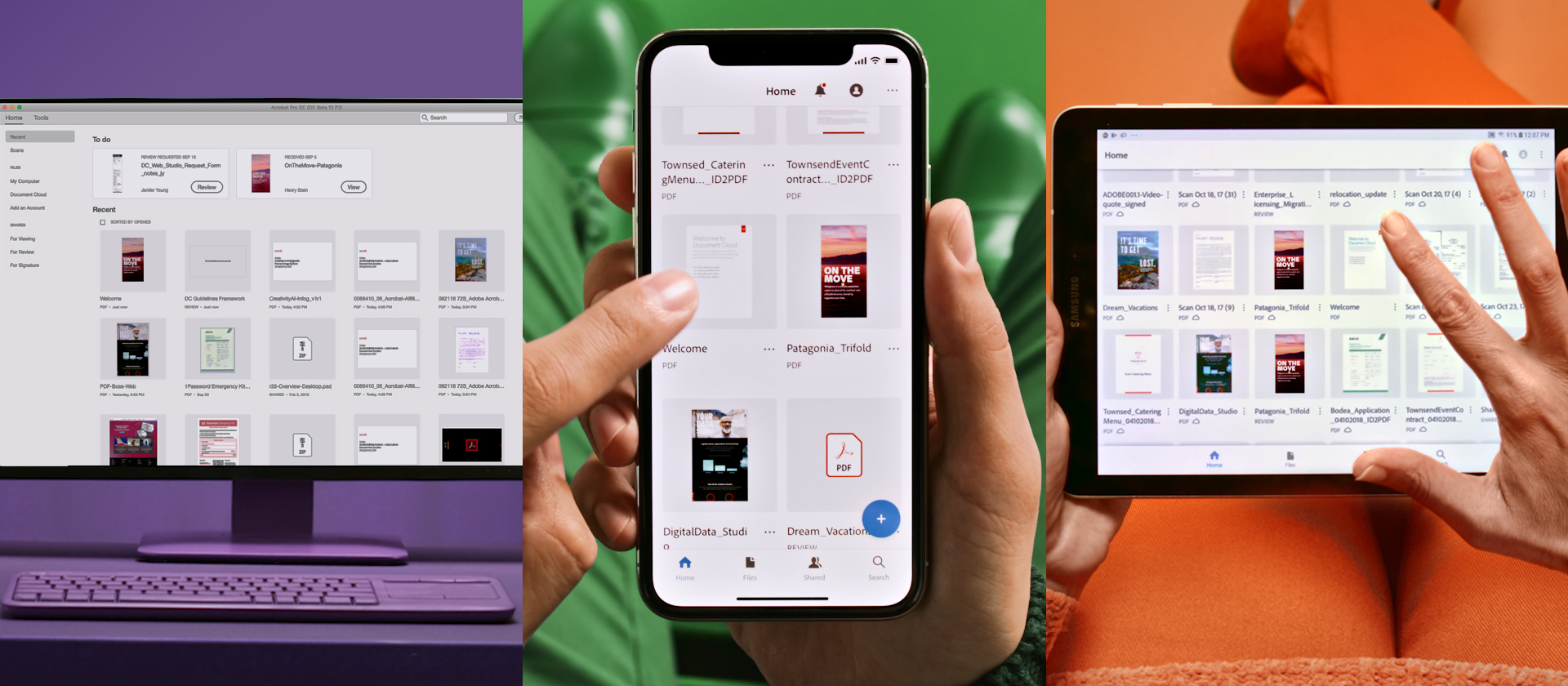
The evolution of Spectrum – looking beyond the creative toolset

Adobe's products serve a diverse array of customers: creative individuals (novice and expert), design studios, document services teams, marketing/analytics organizations, and many others. Despite this diversity, these products are all part of an increasingly integrated ecosystem, so a big part of Spectrum’s job is to bring it all together.

Ultimately, Spectrum grew to encompass a wide array of products and solutions – not just Creative Cloud, but also Acrobat, Marketing Cloud and Adobe's various web interfaces.

Spectrum's design language eventually evolved into a mature design system with multiple implementations – from its highly tokenized Spectrum DNA, to Spectrum CSS and Spectrum React. This also included React Aria, a library of unstyled React components and hooks that facilitates the creation of accessible, high-quality UI components for web applications and design systems. My experience working on Spectrum made me a much more well-rounded and technical designer, paving the way for my eventual focus on platform experiences.
Codesign: A modern prototyping tool

At Google, I had a unique opportunity to work with a group of design engineers on a tool that was purpose-built for live prototyping.

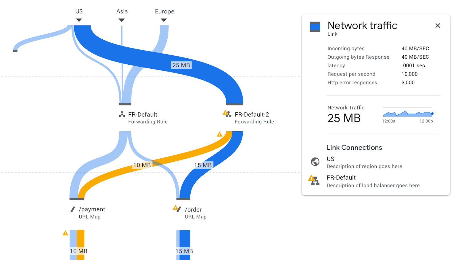
The Google Cloud Console is the world's largest Angular app, with hundreds of pages. We aimed to make it easy for designers and engineers to build new Cloud Console features, with a performant web canvas and simple drag-and-drop functionality.  

In many ways, Codesign was the tool that I had been hoping to build for many years – using real components as building blocks and CSS as the layout medium. Although this tool was internal-only, over 1,000 Googlers were using this weekly, even before our GA launch.
Selected Work – Shopify app platform
Company: Shopify  |  Role: Director

Designing for Developers

I have been leading the design of Shopify's app platform since 2021.

During that time, we've seen this grow from a loosely affiliated collection of tools and services to cohesive, fully-featured, interconnected platform supporting thousands of apps (including 76,000 new apps in 2024), millions of app installations (>25M), and over a billion dollars in developer revenue in the previous year. No matter which measurement you use, Shopify runs one of the world's top five largest app ecosystems, through which hundreds of billions of dollars of gross merchant value (GMV) flows every year.

Shown above – the developer console in summer of 2025.
Shopify.dev – a love letter to developers

Shopify's developer documentation plays a crucial role in helping app builders. The site, which encompasses over 2,500 articles of content, is a comprehensive repository of knowledge and references, spanning every API, function, component and pattern available to developers. Making sense of all this complexity requires a fine attention to the details: colors, badges, accordions, code boxes, diagrams – all of these have been crafted with attention to helping developers navigate this complexity.

It also includes Shopify's dev assistant, shown above, which is an AI chat agent that can answer questions, guide you to answers, or give you code to use in your project. Additionally, all of Shopify's references are hosted on MCP server for easy use within a developer's IDE.
Apps for every purpose

With tens of thousands of apps available to merchants – including several built by Shopify – the app ecosystem fills a valuable space in the merchant's journey of building their business, while providing a critical moat for the company. Any way you want to sell, whether that be through bundles, subscriptions or discounts; domestically or internationally; or as a boutique or large-scale seller, there are apps merchants can use to power their store.

Apps extend every Shopify surface. This includes the ability to  extend the merchant admin (Transcy, shown above), checkout and point of sale.
Raising the bar of app quality

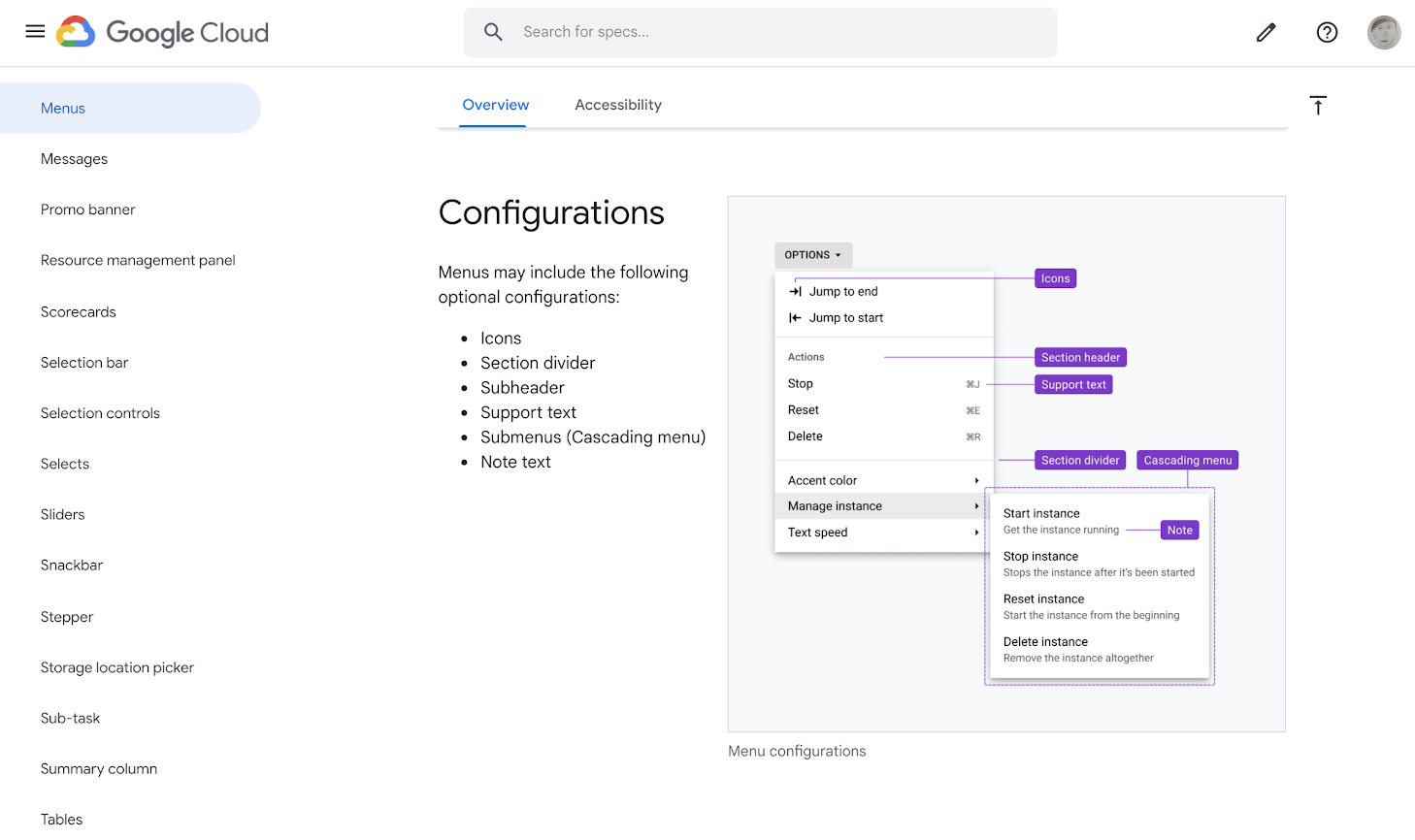
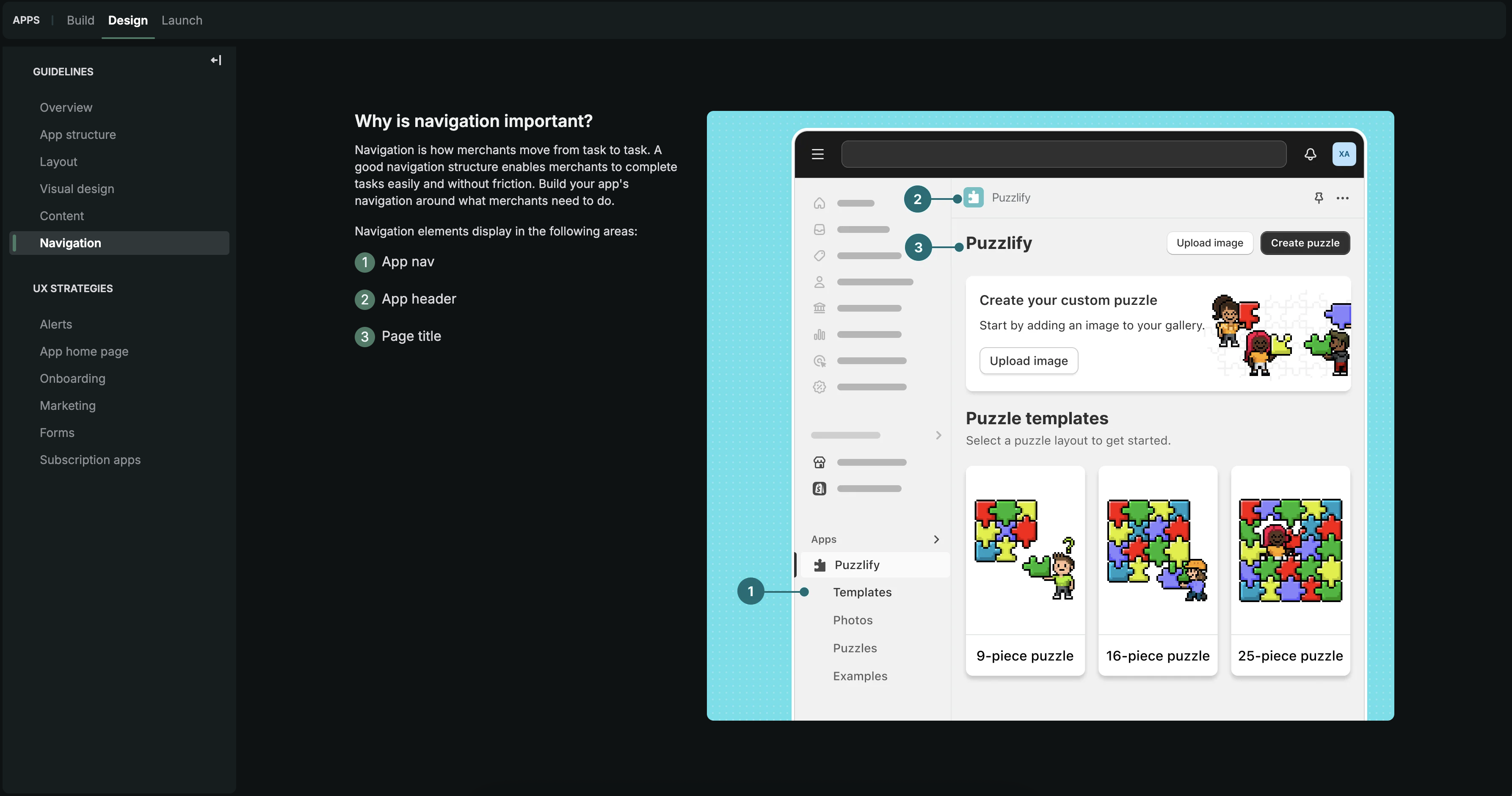
One of the team's most important aims is to explain not just the what, but also the why behind how to build great apps. App developers often told us how valuable is to have an opinionated set of design guidelines – but we also recognized that these guidelines need to be backed up with well-crafted and flexible web components, patterns with usable code, and the ability to test and iterate quickly.

In addition, in 2023 the team created a new program: Built For Shopify. This introduced a new quality tier to the ecosystem, whereby app developers who met additional standards would be rewarded with Shopify's seal of quality and premium placement in the app store.

In all of these cases, the design team was often a key decided in determining these standards, and explaining them to developers.
Showcasing merchant value

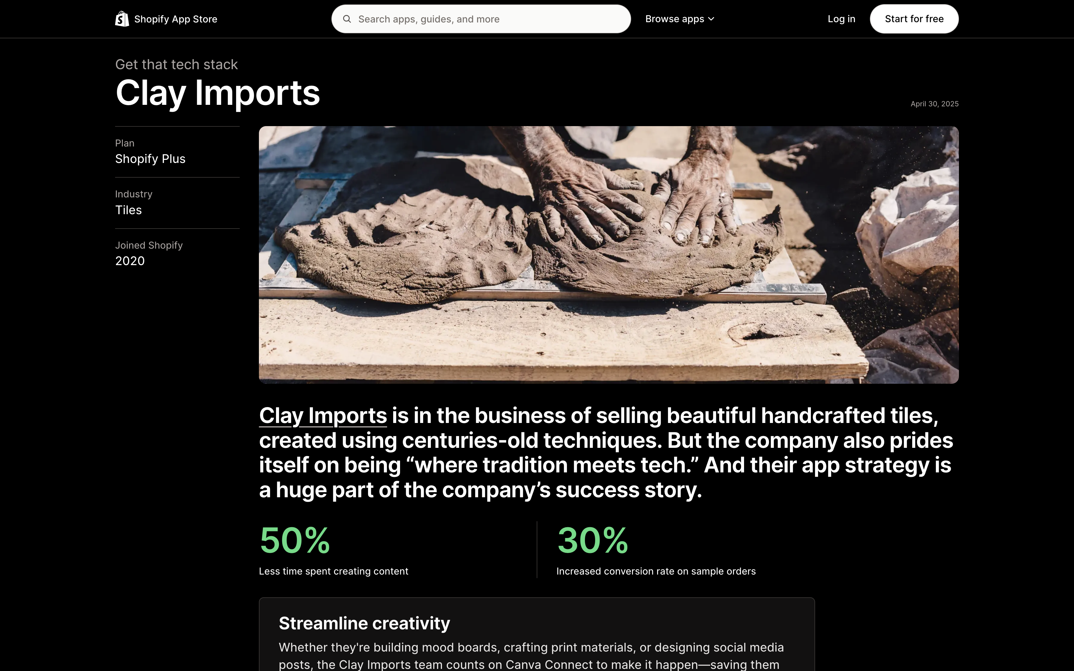
Shopify's app store is not just a place to find and install apps – it's also a place for merchants to learn. Our editorial design includes features that peel back the cover of how successful merchants have set up their store, with app recommendations and testimonials to guide merchants' decisions when deciding which apps might be right for them. The design approach to these features is bold type and beautiful imagery, combined with meaningful store data and technical informaton to keep the story grounded.

Design as a technical craft

One of my aims in leading design teams is to build a culture of technical proficiency. I'm proud to have led – and learned from – UX engineers and creative technologists, and to have sponsored the development of such disciplines at multiple companies.